Nick Dewar—a Scottish-born artist with the power to elegantly provoke thought—has died at 37. He was an illustrator whose subtleties appealed equally to the eye and to the brain: gracefully making analogies and arguments with striking, deceptively simple images. No surprise that these talents made him a favorite of editors everywhere. Surfacing in places like The Atlantic Monthly and The New York Times, he made great newspapers and magazines look better and look smarter.
His draftsmanship was marked by restraint and precision—if the piece didn’t need x, then x didn’t go in, often leaving his subjects in flat seas of solid color. “Personally I am a big believer in voluntary simplicity and try to discard everything that is unnecessary in my daily life,” he wrote on his site. “I think this has a lot to do with how my work looks.” Whether he was working analog—he preferred a sable brush, acrylic paints from Lefranc et Bourgeois’s Flashe range and Cartoon Colour’s Cel-Vinyl series, Strathmore plate-surface bristol board—or digitally, a sense of self-control kept his work free of frills, even of texture.
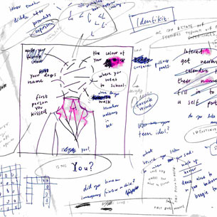
This allowed us to focus on the ideas. And Dewar had a lot of them, literally piles of them scattered throughout sketchbooks. As effortless as he makes it look, it was clear that he devoted intense mental effort to his projects, filtering everything through his sophisticated humor, visual and verbal wit, and Magritte-like zest for the surreal.

Dewar’s fluid strokes and retro figures brought to mind both Charles Burns (expressive faces, lustrous hair) and Christoph Niemann (gray suits, intellect, high comedy). Perhaps a more minimalist Daniel Clowes. You suspect that he could craft a brilliant graphic novel. Beyond these traits, a recurring set of images also connected his diverse body of work:
- Objects vaporously forming, genie-like, out of other objects
- Mirror images and detached faces
- Translucent figures and outlines
- Handlebar mustaches
- Human-shaped nonhumans
- Pinstripes coming to life
- Thick, transforming beams of light
- Colors that radiate warmth even when textbooks call them cool (his favorites: “certain dusky brown, greens, blues and deep yellow and oranges”)
- Muscular and blocky prewar lettering a la Chris Ware
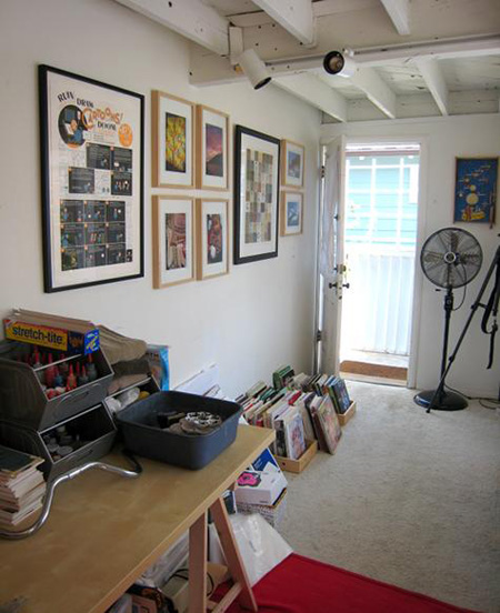
We encourage you to visit Design Sponge, to see arguably their all-time best Sneak Peek into his living and working space. The line between life and art is thin, it turns out: Dewar writes beautifully and funnily about a place that is, inspiringly, at once spartan and steeped in art. On the wall, you can spot a giant silk-screened Chris Ware panel.

A Book By Its Cover allows us to briefly invade his privacy, too: through his sketchbooks!

Notice the ratio of words and ideas to images. And notice all the circling and scratching out, all the testing and sorting through. This is ample evidence of a restless mind, which makes for a better illustrator. To enrich your art, he suggests on his site, you have to enrich your life and brain: read lots, look at other people’s work, cultivate interests, travel. Clearly he practices what he preaches. On the same page, he delves deeply into this process, with his customary warmth and deadpan asides.
We took notes. We’ll miss him dearly.
Buy his prints at Thumbtack Press. Trawl Google Images for his commissions. Pore over his work in his portfolio or at Veer. Marvel at his contribution to Readymade’s WPA-inspired Poster Children project. Flip through his Flickr stream.