color blast

me_up_a_tree_nytimes_web

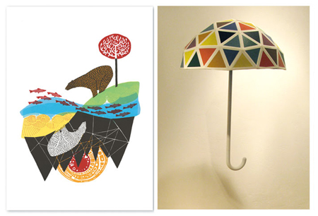
holder_webWe’ve accumulated a few illustration books/magazines lately, and I haven’t had the time to go look at them more throughly. A few pieces from American Illustration 27 that caught my  eye tonight- looks like color blast is the theme.

Top: Me Up A Tree for the column “On Language” for the New York Times. I’ve been using a lot of cut paper recently & I love the look of the “D” & “A”

Bottom: Both by Andrew Holder. (r) Two Bears. Reversible 6 color silk-screen (l) Untitled. Installation for Neon Frontier Show.

g’night. ZzZz

that feeling of nostalgia

Up_EricTan


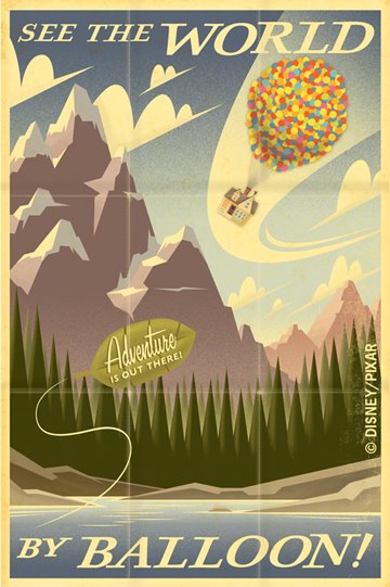
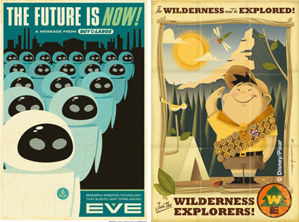
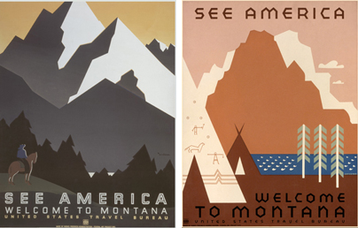
Gimme! Today, I came across these beautiful posters by artist Eric Tan. Inspired by Disneyland attraction posters from the 60s, he is famous for his “retro-futurist remix posters” of popular films like Indiana Jones and The Incredibles. This one for Up reminds me of the See America project put out by the Works  Progress Administration. The folded creases makes the poster even sweeter. Here is Tan in his own words:

I think retro advertising might work because they’re based in something we’re all used to seeing. There’s a comfort in that. There was a defining look to past decades that immediately brings you back to those days. If our job as artists/communicators is to evoke a feeling and/or emotion out of a piece, it’s a good way to instantly bring the viewer that feeling of nostalgia.

more of his work:

erictan_duo

WPA |Montana

montana_wpa


I’m definitely going to keep these in mind as references for future assignments. Maybe I can have my students revisit their favorite movie or vacation postcards as a catalyst for new designs? Their bookcover redesigns came out wonderfully but I can’t post any due to copyright. Must find a way to do this.

imperfect grids, polka dots

recent purchases:

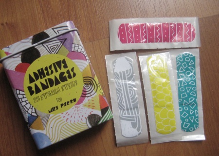
mike_perry_bandaid
Mike Perry Bandages from UO. I scored it at the bottom of the basket for 1.99!!! Now you can look stylish even when you’re hurt.

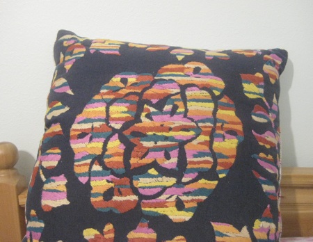
anthro_pillow

Anthropologie pillow.

Major plus: you can wash the covers easily. :) Did you know that, when we were younger, my mom put a plastic tarp underneath our eating table because we were so messy? It was much easier for her to shake the food off outside than to clean up the floor. Don’t we sound a little barbaric?  See, I didn’t like to eat meat when I was small, so I would strategically  throw it under other people’s seats and then offer to clean up after the meal. Or I would hide huge chunks of meat in plant pots. Muahaha.

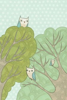
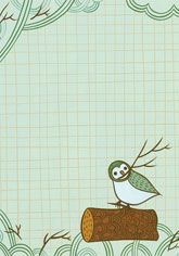
chronicle_books journal_detail Chronicle Books journal. I love the color palette, and the inside pages have more pretty designs like: imperfect grids, polka dots, etc. In this case, I think it’s an owl done right. Just sayin’

dress_sneakSneak peak at my dress.

So I bought the first one I tried on. (I did try on 1 other after that.) I know that probably goes against all the “rules” but I wanted to get this step over with. Don’t get me wrong: it’s beautiful and my mom really likes it, too, but the more important things to me are planning activities, food, and CANDY. Also, when school starts up, I’d rather sleep in than drive around in the heat shopping for my dress. Now I need to find a good seamstress and that’ll be one huge thing I can check off my list.

thuy_momMom and baby sister, Thuy. Don’t they look cute?

Jury duty tomorrow!

this is our ending, this is our past

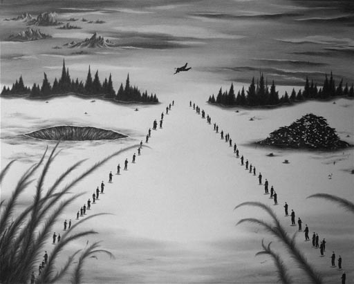
I’ve been more and more surprised by the opportunities there are in Texas for the visual arts both in the classroom and for artists. Robyn O’Neil is the latest artist to win the Hunting Art Prize—$50,000! She’s also been featured in the Whitney Biennial and Vitamin D.

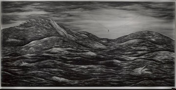
thesefinalhoursembraceatlastthisisourendingthisisourpast_smallThese final hours embrace at last; this is our ending, this is our past.

This is one of my favorite pieces by O’Neil and when BJ bought an issue of The Believer, it was included as a huge insert.

oneil_huntingprize

A death, a fall, a march: toward a better world, graphite on paper. (Winning piece)

clutch city

YAY ROCKETS!

rockets_banner

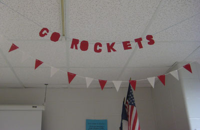
 I used some cardstock paper to make this banner for my classroom. 

rockets_watch Aaron Brooks scores another 3. Look at Igby sleeping on my shoulder!

The past few weeks have revolved around Rocket games: when to sleep, when to go to the gym, when to eat, when to start Mother’s Day brunch, when to wear red, and so on. I was lucky enough to go to Game 4, and although I lost my voice screaming and cheering and I gained a few pounds from the fries it was still fun despite the lost. Today was a much better and exciting game!

perry_owen_shirts

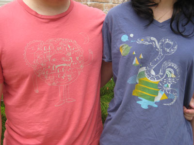
BJ and I are finally wearing our GAP (RED) artist’s T’s on the same day. His is by Mike Perry and mine is by Matt Owen. Summer break can’t come any sooner. I desperately need some rest, but I feel very blessed that the first year has gone by relatively smoothly.

I do not reproduce events

This week, we’re starting an introduction into jewelry with my beginning classes. I’m hoping for no injuries! While putting together my presentations, I remembered these two artists who greatly influenced my love for jewelry. Although I only have one class under my belt, I’m dying to make something!

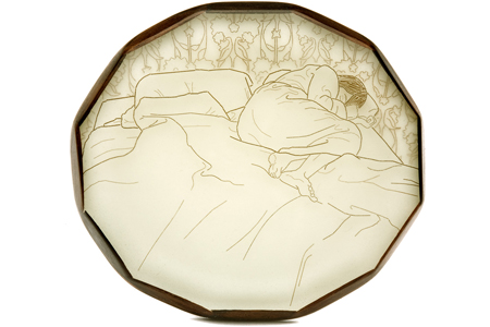
08napMelanie Bilenker

Nap. Brooch. 2008. Gold, ebony, resin, pigment, hair

“The Victorians kept lockets of hair and miniature portraits painted with ground hair and pigment to secure the memory of a lost love. In much the same way, I secure my memories through photographic images rendered in lines of my own hair, the physical remnants. I do not reproduce events, but quiet minutes, the mundane, the domestic, the ordinary moments.”

bodemer_rings

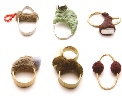
Iris Bodemer

A beautiful and initmate alternative to the tape and bandages we wrap on the rings we inherit or acquire.

My Bodemer inspired necklace made with beads and trinkets I’ve collected from different significant events and places (cousin’s wedding, Chicago, Providence, favorite outfits, etc.

necklace_detail

photo of the day

redeskog05Source: Carl Kleiner

Trying to gather up some motivation to grade and get my day started, but then Igby joined me for a nap so here I am, still in bed. 

Every woman is an island

I don’t remember exactly how I came to appreciate art. But I do know that I didn’t begin with Ab Ex cowboys like Pollock and De Kooning, much as I came to love them later on. I began, I’m nearly sure, with the more or less famous works of the all-American painters: Hopper, Homer, and Wyeth. That meant Hopper’s Nighthawks, Homer’s Gulf Stream, and, of course, Wyeth’s Christina’s World. They all communicated different varieties of a loneliness that seemed essentially American: Hopper’s metropolitan anonymity, Homer’s man-against-the-elements tussle, and Wyeth’s solitude of the iron will. In the words of D.H. Lawrence: “The essential American soul is hard, isolate, stoic, and a killer. It has never yet melted.” These paintings couldn’t melt. Each one had an air of melancholy that spoke to my own melancholy.

Christina's World

Christina’s World struck me as a triumph of craft. The grey-gold hue of the field came close to the appearance of bruised flesh. Amber waves of grain, these were not. No, this work of art is far from a testament to nature’s beauty and bounty. Christina’s twisted posture alone seemed patently unnatural, curving toward the house, as the road curved away. From the looks of it, she had no use for roads and paths. Thoreau might as well have been talking about her:

I wanted to live deep and suck out all the marrow of life, to live so sturdily and Spartan-like as to put to rout all that was not life, to cut a broad swath and shave close, to drive life into a corner, and reduce it to its lowest terms, and, if it proved to be mean, why then to get the whole and genuine meanness of it, and publish its meanness to the world; or if it were sublime, to know it by experience, and be able to give a true account of it…

Christina had no say: she was born to the mean minimal life of the country cripple. But she would hardly accept a limited existence, imprisoned in her own quarters, in a chair, cut off from that windy land and the big-sky landscape. She’d wrest liberty back. She would cut that broad swath—as she did very literally in Wyeth’s bone-dry grass, having wandered so far afield that her house fades into a cloudy silhouette against the horizon. The background is dark for a reason: like everything else, the Depression turned it into a gloomy husk of its original form. The background is also small for a reason. Wyeth’s composition thrusts Christina so far into the foreground that she dwarfs the that faraway house, comparing the largeness of her will to the smallness of anything that might confine it. Or define it.

“Formulaic stuff not very effective even as illustrational ‘realism,'” is how Peter Schjeldahl wrote this off. Art critics at the time were brandishing arms and theories in defense of Modernism. This was the time of Pollock and here was Wyeth, the consummate realist sticking to his guns, while the world was seduced by abstraction. It’s no surprise that illustrators today stand by him. His style seemed to gracefully encompass both a gestural wildness and painstaking detail, a sense of hope alongside misanthropy. He illustrated one thing to perfection: how an artist can brave the bandwagon mentality of the art world, without giving up a single facet of his singular vision.

rs

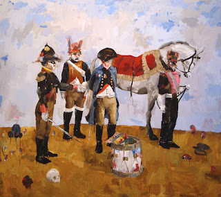
John Copeland

I’ve been following John Copeland ever since I stumbled across his sketchbooks where each page stands as a piece of art itself. His style has evolved over the years but his work is always captivating. In his newer paintings, he hints at a much darker tone, both in the way he paints and the subject matter, and they allow for multiple narratives to enter into play. Here the past and present collide to create a sense of uneasiness and anxiety. A comment of our time maybe? Nevertheless, I enjoy the ambiguity.

“for the wise men and the fools”
johncopeland.com