
Beyond happy for Fishing Without Nets winning the Jury Prize in Short Filming!
I only saw BJ’s design for the film’s movie poster in the beginning stages and loved how it turned out.

Beyond happy for Fishing Without Nets winning the Jury Prize in Short Filming!
I only saw BJ’s design for the film’s movie poster in the beginning stages and loved how it turned out.

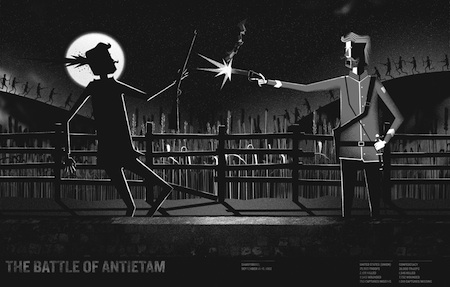


Lately I’ve been able to concentrate and work on a few projects. It’s like I finally got into the grove, but school and lesson planning may disrupt that very soon. Eek. But today I came across the Momentus series and I think it will resonate well with some of my design students. I’m always looking for visual references to show them. Last year, Olly Moss and Albert Exergian‘s redesigned movie/tv posters were a hit so when I find something new to add to the mix it makes coming back to school a little easier. From the site:
A collaborative project in which a select group of designers, illustrators, and artists create visual interpretations of the most defining moments in United States history as a way of informing others of our proud, yet sometimes troubled and forgotten past.
I recently picked up Print’s 20 under 30 issue, and Jeseok Yi‘s work most intensely spoke to me. Social design that looks cool, informs, compels the viewer to take action, and lingers in the mind for minutes, days, etc. is usually hard to come by. An exciting aspect of Yi’s work has nothing to do with “making type look great and doing Photoshop like a machine”—heavy on digital technique, light on ideas. Rather, it’s the way Yi stresses the simplicity and interaction between design and its real-world environment. I think his work will speak to my students too.

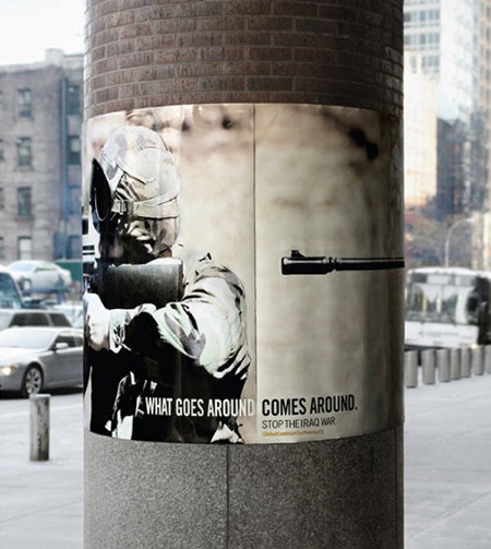
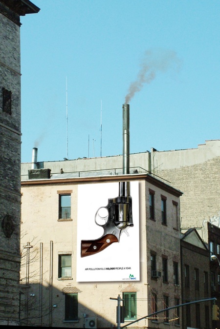
On a slightly similar note, thank you, Jennifer for the smart reminder/tip about helping with Japan’s long term earthquake relief efforts, especially as we continue to learn more about the aftermath and where help is most needed.
Thank you, internet.
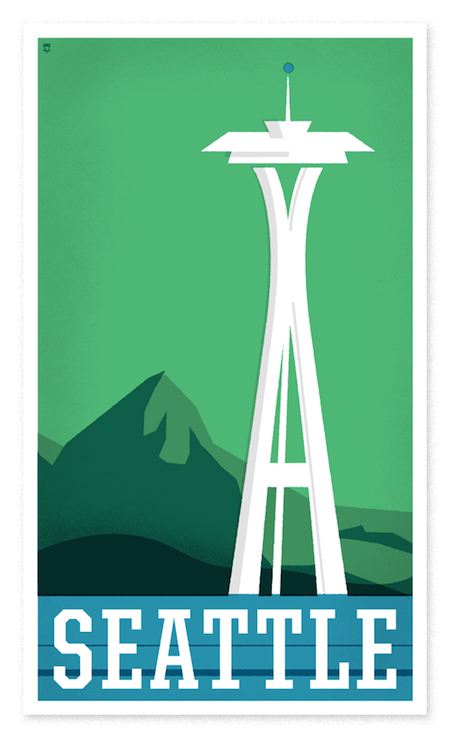
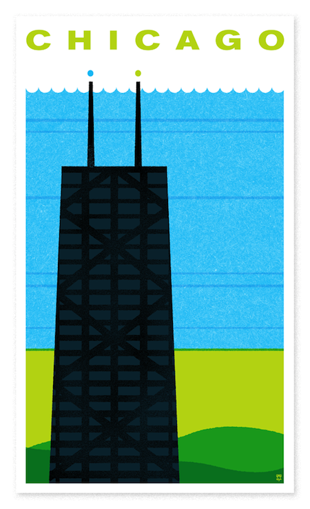
We’re loving the limited edition travel poster series put out by The Heads of State. I can’t decided which one to get for our place but it’s between one of the three below.And although I was initially lured in by their concert posters, the editorial illustrations are the real gems.

One of my former student’s movie poster she turned in for her design class at SCAD. All paper cut!

Inspiration from the web. I love the simplicity of these posters as well as the designers’ other work. (Click on the links to see more)
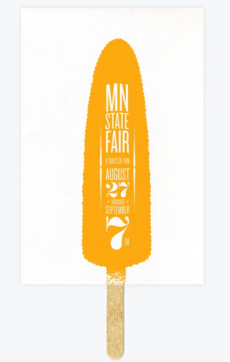
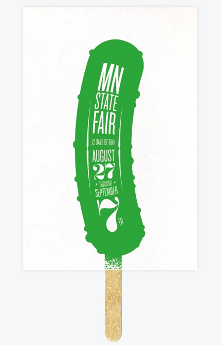
Allan Peters‘ Poster-On-A-Stick. More here.
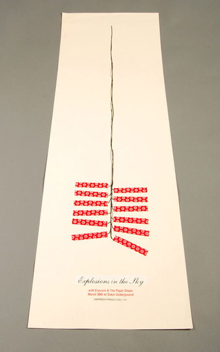
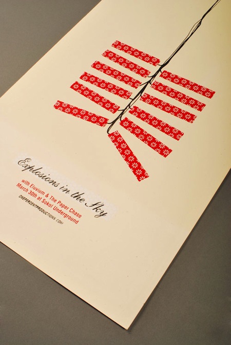
Micah Max‘s Explosion in the Sky concert poster. And in his own words:
The firecrackers and their abnormally long fuse, represent the band’s ability to go from quiet, shimmering beauty to bold, loud passages in an instant. It’s always fun to do work for a band that I greatly admire.
Hat tip: Twig & Thistle

Beautiful. Reminds me of summer.
I never saw this film, but  I always remembered the poster. Designed by Michael Gillette.
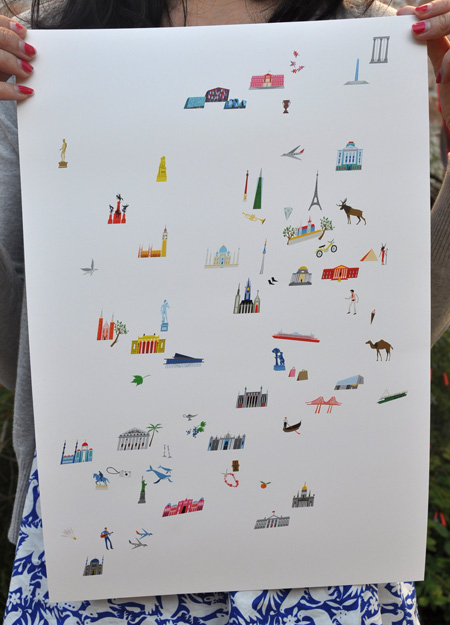
Lena Corwin’s Travel Poster from BJ. The mail gods were interfering with our plans to get this poster in our hands, but Lena persevered, and it finally got to us! The poster is basically a tour of European architecture—italicized!
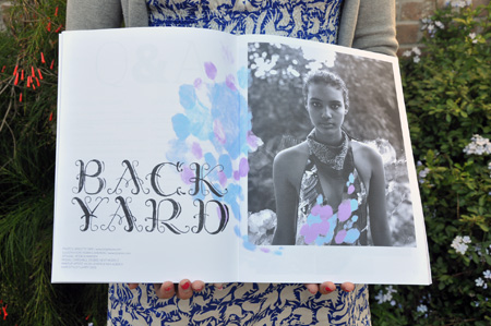
Some of the best things to receive, buy, share are Mike Perry‘s printed works. I snagged Issue #2 (Swimsuit Edition) of Untitled, a zine devoted to his shifting interests. I admire how each element of it—the pictures, clothes, drawings, etc.—belongs to a collaborative effort and one does not outshine the other. Anna’s poetic black-and-white photographs and Mike’s innocent injections of color are the perfect complements.
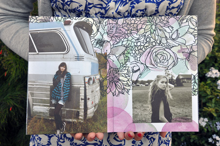
Untitled Issue # 3 One Photo Shoot
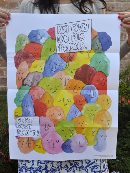
This poster was tucked among the zines as a nice surprise. It looks like a dog-pile of monsters made out of sherbet. I think it’ll go perfectly in my classroom!

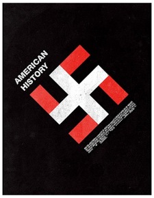
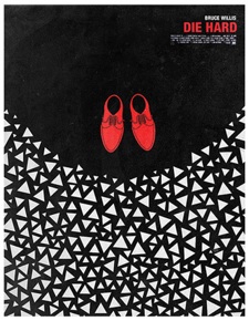
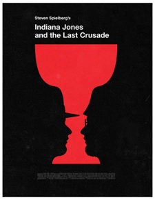

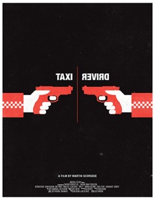
Olly Moss‘s film poster remixes. Genius. I really admire how he uses  limited tools to perfectly capture the essence of the subject—something I try to reiterate to my students. I can’t blame them for thinking kitchen-sink maximalism is good; ads and magazine pages today are so crowded. I got a headache flipping through my sister’s Seventeen magazine last night. Those layouts are craazzzzy.
Gah. These are so good. And he’s only 22!