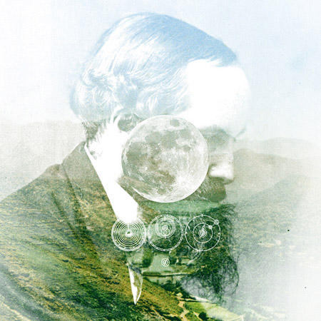
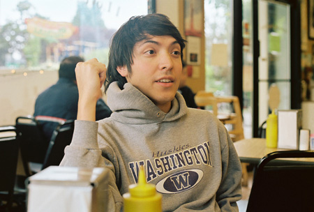
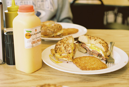
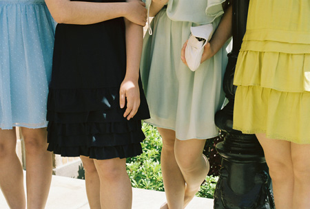
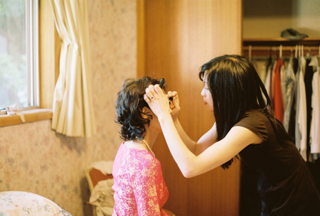
I had the first roll of film from our NW trip processed, and tomorrow I’m going to attempt to pull the second roll out of the camera and place it back in the canister. There are definitely light leaks, but I’m crossing my fingers that the rest will turn out. A huge thank you to Ameet for the camera (Canon AE-1), it feels great to shot again! More pictures and info here.
Emotionally elsewhere
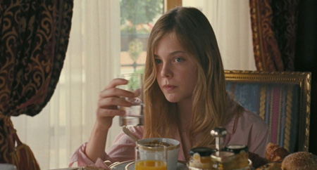
Still rolling Sofia Coppola’s movie around in the mind. It has its share of critics, which is fine, but I think a lot of them are missing the point, and revealing their own hang-ups with her charmed life and career. Better to set that aside.
As I see it, Johnny Marco suffers from a malady called celebrity. The entertainer can’t be entertained: a steady stream of Hollywood pleasure-on-demand has deadened his nerve endings. Joy must belong to his humbler past. Things are different now: all that material success has led to an inner failure, something nicely hit upon by Walter Benjamin (1928: success dulls the mind) and Willie Nelson (1977: so-called successful lives leave behind the basics of love).
In Johnny’s pampered present, he’s absent. Physically he’s there, drifting through the parties and the junkets, into the anonymous bedrooms. But he’s emotionally elsewhere. Often seen as the summit of American success—the rise from mere man to big-screen hero—Coppola gives us an insider’s view of stardom as a somewhat tragicomic condition of existence. From her casting (Chris Pontius, the girl from the Office) to her art direction (the spot-on “Berlin Agenda†poster) one can safely infer that she has a sense of humor about this: the crucial “comic†in “tragicomic.†After all, it is not exactly profound or innovative to argue that money and fame do not beget happiness; this is not Somewhere’s aim. Instead the film serves more as evocation than argument, watching with sympathy and patience and even humor how today’s cultural gods reveal and cherish their humanity, how they mourn its surrender, and ache for its recovery.
-B
15 x 15
Some things I’ve been working on. I find that working in groups of 15 helps me concentrate and stay focused. I’m excited to see how it’ll progress and evolve.
At the same time, I have lots of unfinished projects both work-related and personal that are in the middle or almost done. Finishing has always been a struggle for me. Over the last week I’ve tried working with a timer, writing lists, using post-its on my desk, and making notes on my phone. Intense, but I need all the help I can get! Then there’s the creative block and feeling totally unoriginal… pff. I’ll save that for another day.
— C
Fluorescent vertigo and the repose of pure color
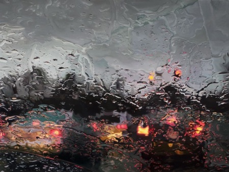
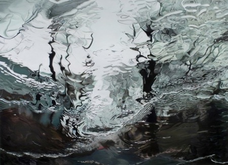
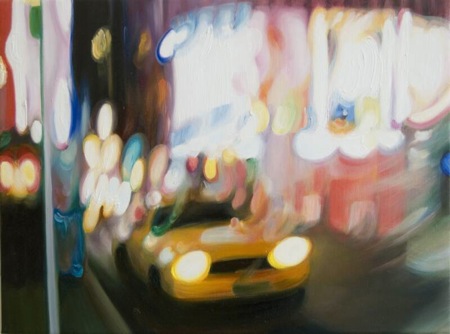
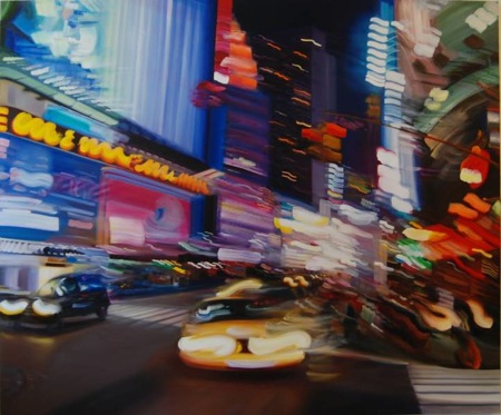
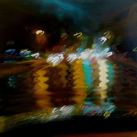
What drives Gregory Thielker and Alexandra Pacula? Their styles of oil painting are shaped by photography and filtered through car windows. Both pay homage to an instrument praised for transparently rendering reality—yet their paintings withhold the straightforward picture you would expect. They like to place obstacles between the observer and observed. Thielker chooses rain, bringing photorealistic detail to drenched windshields, an everyday scenario where unmediated vision might actually save your life. Pacula, by contrast, chooses a style of blurring that mimics the woozy smears of long-exposed film. These artists tilt representation toward abstraction, one extracting vitality from stillness and silence, the other turning the commotion of real life into the repose of pure color.
Gregory Thielker shows us a world lighted less by the sun than by the red glare of brake lights and traffic lights. It’s an overcast, halted place. Here everything—which is to say, nothing—seems to occur under rain clouds or the cover of nightfall. If we’re not waiting on the road, we’re in parking lots. This inert realm outside the vehicle is refracted through patterns of rainwater: waxy droplets, lattices, and sheets of rippling liquid. Thielker’s lyrically fractured vision lends a sense of mystery and activity, a fugitive spark of life, to the quiet routine of a country locked in its own cars.
Alexandra Pacula gazes outward from a quintessentially New York point of view: a taxicab window. She presents a sunless setting, too, though in her images we find more headlights, neon signage, and peeks into brightly lit interiors. Lights, in other words, that approach us and invite us in. Little can be seen clearly because the passage of time blurs and bends the scenes like memories. Clarity doesn’t attract Pacula. She prefers the delights of the deceiving mind—and camera. Watching the glow of storefronts and passing cars and street lamps melt into twitchy trails of color, after all, one thinks of long-exposure photographs and their disloyalty to reality. Her paintings likewise rebel. They side against the frenzy and fluorescent vertigo of the city at night, rebuilding blandly busy moments as absolute visual spaces into which the beholder can escape.
—B
Tinsel icicles and watercolor bunny

- Les Givral’s nest of 2×4’s. BJ and I were craving their bbq pork & pâté banh mi .
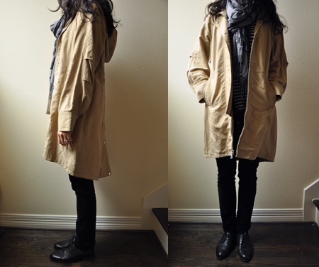
- Barney’s Co-op is closing their Houston store. I bought one Richard Chai LOVE hooded parka for my sister Thuy and one for me. The drape and details are nice with plenty of room for layering. Plus you can’t beat a deal that is almost 90% off!
- The weather is finally feeling like winter! I think the decorations will have to stay up a little longer.
- Tinsel icicles on clearance + washi tape = a Confetti System-inspired project.
- This watercolor portrait of Baby Bunny is a present from Julia made with the Christmas presents we gave her. I love her background!
Factory Brat
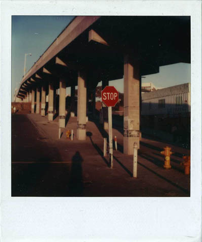
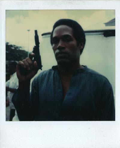
Attention, devotees of instant film. We propose that you spend a few minutes poring over Christopher Makos’s SX-70 beauties—or, if you’re in New York, to take in the fifty on display at the Christopher Henry Gallery. Enjoy the brushes with artists, musicians, and disgraced former athletes.
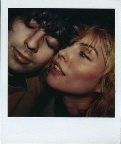
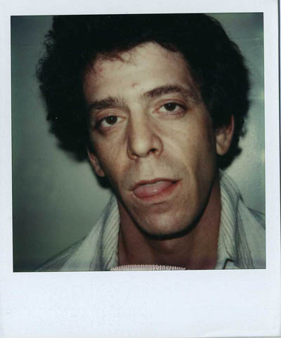
Makos belonged to the scapegrace entourage that loyally shadowed Andy Warhol. A movement that worshiped the moment. With a mix of love and awe, as the Factory’s house photographer, Makos preserved its history in images. Uniquely suited to this task was his Polaroid SX-70. It was portable and hence pass-around-able. It cherished accidents. And it had mood swings. The camera could toss a wintry silence over any scene, making it pale and bluish and still, yet it could also warm it up, plating yellows in gold or lending flat reds an almost bloody vitality. Hunting for the right adjective for this phenomenon, most settle on dreamy. Dreamy because you know you’re eyeing objects that exist in reality, and yet, whether or not you can put a finger on it, something—the cloudy light? the sanded edges? the deathly skin tones?—seems a touch off. Very faintly, in a word, unreal. Cameras were built to record plain-vanilla reality, but the Polaroid seems magically engineered to flavor, spice, season it. To make the familiar subtly unfamiliar. We couldn’t imagine a better way to remember Warhol and his Factory, and those after-hours adventures in the shabby, sincere, wide-eyed world of 1970’s and 1980’s New York.
Goodbye, Nick Dewar

Nick Dewar—a Scottish-born artist with the power to elegantly provoke thought—has died at 37. He was an illustrator whose subtleties appealed equally to the eye and to the brain: gracefully making analogies and arguments with striking, deceptively simple images. No surprise that these talents made him a favorite of editors everywhere. Surfacing in places like The Atlantic Monthly and The New York Times, he made great newspapers and magazines look better and look smarter.
His draftsmanship was marked by restraint and precision—if the piece didn’t need x, then x didn’t go in, often leaving his subjects in flat seas of solid color. “Personally I am a big believer in voluntary simplicity and try to discard everything that is unnecessary in my daily life,” he wrote on his site. “I think this has a lot to do with how my work looks.” Whether he was working analog—he preferred a sable brush, acrylic paints from Lefranc et Bourgeois’s Flashe range and Cartoon Colour’s Cel-Vinyl series, Strathmore plate-surface bristol board—or digitally, a sense of self-control kept his work free of frills, even of texture.
This allowed us to focus on the ideas. And Dewar had a lot of them, literally piles of them scattered throughout sketchbooks. As effortless as he makes it look, it was clear that he devoted intense mental effort to his projects, filtering everything through his sophisticated humor, visual and verbal wit, and Magritte-like zest for the surreal.

Dewar’s fluid strokes and retro figures brought to mind both Charles Burns (expressive faces, lustrous hair) and Christoph Niemann (gray suits, intellect, high comedy). Perhaps a more minimalist Daniel Clowes. You suspect that he could craft a brilliant graphic novel. Beyond these traits, a recurring set of images also connected his diverse body of work:
- Objects vaporously forming, genie-like, out of other objects
- Mirror images and detached faces
- Translucent figures and outlines
- Handlebar mustaches
- Human-shaped nonhumans
- Pinstripes coming to life
- Thick, transforming beams of light
- Colors that radiate warmth even when textbooks call them cool (his favorites: “certain dusky brown, greens, blues and deep yellow and oranges”)
- Muscular and blocky prewar lettering a la Chris Ware
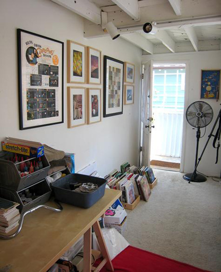
We encourage you to visit Design Sponge, to see arguably their all-time best Sneak Peek into his living and working space. The line between life and art is thin, it turns out: Dewar writes beautifully and funnily about a place that is, inspiringly, at once spartan and steeped in art. On the wall, you can spot a giant silk-screened Chris Ware panel.
A Book By Its Cover allows us to briefly invade his privacy, too: through his sketchbooks!
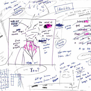
Notice the ratio of words and ideas to images. And notice all the circling and scratching out, all the testing and sorting through. This is ample evidence of a restless mind, which makes for a better illustrator. To enrich your art, he suggests on his site, you have to enrich your life and brain: read lots, look at other people’s work, cultivate interests, travel. Clearly he practices what he preaches. On the same page, he delves deeply into this process, with his customary warmth and deadpan asides.
We took notes. We’ll miss him dearly.
Buy his prints at Thumbtack Press. Trawl Google Images for his commissions. Pore over his work in his portfolio or at Veer. Marvel at his contribution to Readymade’s WPA-inspired Poster Children project. Flip through his Flickr stream.
Tractor-beamed skyward

Denis Darzacq, Hyper No.20, 2007. 50 x 40″.
Denis Darzacq’s Hyper exhibition, at the Laurence Miller Gallery, ventures into the supermarket. Obviously this isn’t your average grocery store. Bodies pause mid-air near the frozen food, bend at freak angles, levitate toward the top shelves. But why, of all places, in this place? Darzacq seems to be casting his solitary souls into Andreas Gursky’s famous panorama of merchandise.

Andreas Gursky,99 cent, 1999. 6′ 9 1/2″ x 11′.
Too many choices and desires overwhelm us, Gursky’s rainbows of sugar and plastic tell us. Putting people in the foreground, not things or crowds, Darzacq renders this same feeling in a more haunting style. There’s something empty and creepy about our zombielike urge to accumulate, and here that emptiness and creepiness is given form: the subjects are tractor-beamed skyward by unseen forces; their faces swivel mysteriously away from us; a sickly fluorescent light refrigerates every composition; the aisles are cleared, you suspect, even of sound. These tableaux vivants, like those of Gregory Crewdson, remind you that the ordinary world we’ve taken for granted is, on closer inspection, a good deal more surreal than we notice.

Denis Darzacq, Hyper No.3, 2007. 50 x 40″.
an attitude of childlike discovery
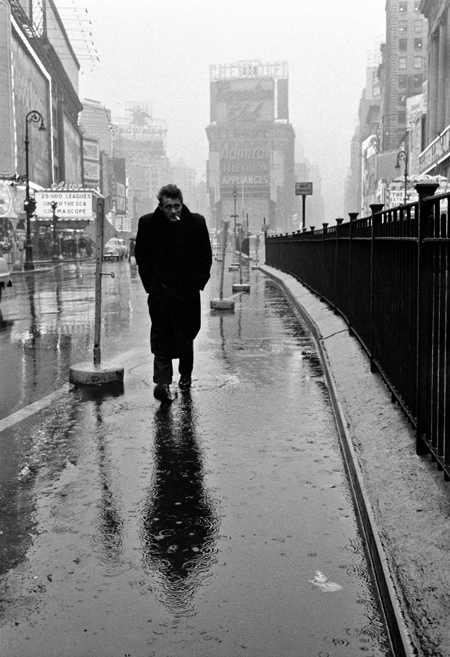
The story of Dennis Stock (1928-2010) is intertwined with the story of cool. Such is the fate of a virtuoso photographer who, present at the right time and the right place, potently documented America’s passage from strait-laced postwar gloom into the fiery emotions of the misfit mid-century. His portraits hinted at the blooming counterculture: a dissenting, introspective crowd equally given to brooding loneliness and ecstatic reverie. It is no exaggeration to say that, for one, his 1955 shots for Life magazine helped craft the myth of James Dean. While shooting a visual essay on the actor not long before his fatal car accident, Stock snapped the legendary, and legend-forging, image of Dean in Times Square, strolling what Life called the the Street of Broken Dreams. As Adam Gopnik saw it: “bearing the weight of a generation on his shoulders.” With his hunched posture, enveloped in his overcoat, and that squint, that cantilevered cigarette, he looked uncannily like Albert Camus. Shielding himself from the rain, seemingly the last citizen of New York, Dean was the picture of the existential loner.
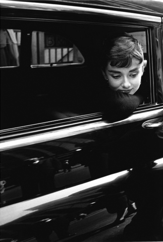
Invited on to the set of Billy Wilder’s film Sabrina, Stock displayed his talent for capturing moments of vulnerability, when artists conscious of publicity and image fleetingly let their guards down. Here we see Audrey Hepburn resting on a car window, lost in thought, perhaps, casting her famously gamine gaze downward. “She was very un-Hollywood, which was the key to the whole thing,” Stock remembered. “She wasn’t glamorous. She didn’t try to be glamorous.”
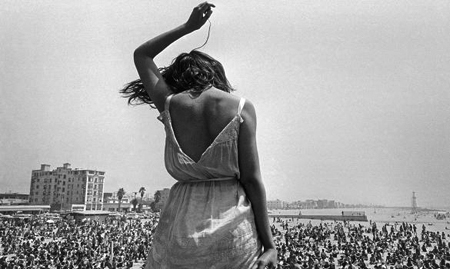
The spirit of the age was available in his portraits: you could sense the national mood shifting. In 1968, freezing a moment of abandon on Venice Beach, he expressed the libertine freedom of that time. A woman stood, back to the camera, against a sea of youth rapt by music, simultaneously an individual and part of something larger. It’s no surprise that his philosophy of photography was refreshing and vital–“To be able to continue an attitude of childlike discovery into adult existence can only be perceived as a gift toward the individual’s spiritual survival”–and it spoke to both the joy of artmaking, and its place in a full life.
Stock worked for the prestigious Magnum agency for six decades. They gather more of his work here.
Annoyingly democratic

Certain mediums of art seem annoyingly democratic. Everyone with a camera thinks he’s magically become a photographer; with Final Cut, a director; with Serato, a DJ. Similar thinking goes with collage. With Photoshop and Google Image Search—or for the stubbornly analog, glue and old magazines—one has all the needed tools to rip new meanings out of old contexts. How does one break any new ground as a combiner of things, while also presenting a distinct voice and vision? The designer Mark Weaver relies on rules. Confining his canvases to a few well-chosen elements—confident typefaces, unpeopled landscapes, period portraits, severe architecture, geometric shapes, arcane charts—he builds a sense of mood and mystery that floats quietly toward the surreal.

