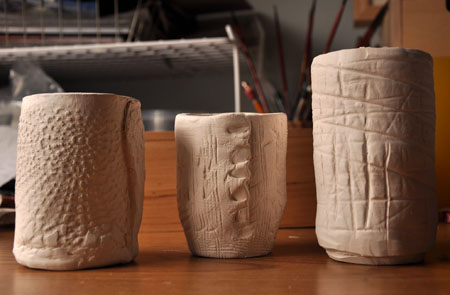

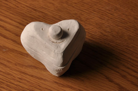
Bisque ware demo pieces. I’m not totally sure what color I’ll glaze them, but I’m leaning towards white or transparent. If I can make at least 25 more, maybe they’ll be used as vases for the reception. We’ll see …
Hello, weekend! I love you!


Bisque ware demo pieces. I’m not totally sure what color I’ll glaze them, but I’m leaning towards white or transparent. If I can make at least 25 more, maybe they’ll be used as vases for the reception. We’ll see …
Hello, weekend! I love you!
B + C
For me, the best way to unwind after a long day is to work on patterns. I wouldn’t mind getting paid to do this all day. The same applies to other activities like cutting rubylith, paper, or split ends. I find the repetitive motions strangely calming (One time I spent two hours at the library looking at split ends instead of writing a paper. Kind of gross, I know.)
Most of the drawings are related to BJ and me—places we’ve been, themes we’re drawn to. The plans are to somehow incorporate it into our wedding, but the ampersand can be easily adapted to other combinations like these:
The possibilities are endless!


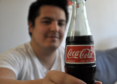
Photos from this weekend
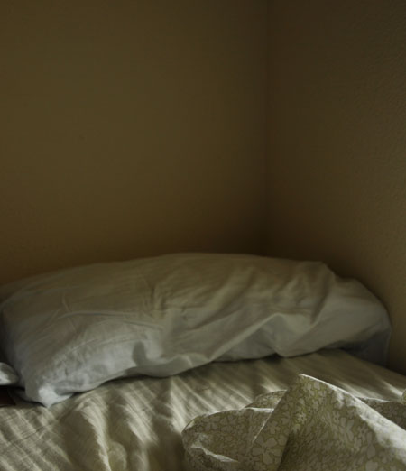
I wish I could hibernate in bed for a week.
An imaginary, ideal outfit that can easily transition from work to Lost watching parties at BJ’s. I know we have plenty of throw blankets, but how comfortable does that wool blanket from Dace look? Maybe if we move north…
I’m feeling a little sick towards the end of the week, and I’ve been curled up on the couch watching ABDC. I’m a little sad the crew from Providence with former Hope High kids didn’t make nationals, but thank God this season isn’t so gimmicky. I overheard some pretty funny conversations when I mentioned to my class that I watch the show. Speaking of which, I realized Friday that my ear can’t pick up certain frequencies anymore. I prided myself in the fact that I could pick up on the mosquito ringtone when students texted each other. It must be annoying for students who hear it but don’t want to be the tattletale. Fortunately, some kids don’t care about that, so when one called out his friend for using the ringtone, I quickly fibbed and said I could hear it too!

Nick Dewar—a Scottish-born artist with the power to elegantly provoke thought—has died at 37. He was an illustrator whose subtleties appealed equally to the eye and to the brain: gracefully making analogies and arguments with striking, deceptively simple images. No surprise that these talents made him a favorite of editors everywhere. Surfacing in places like The Atlantic Monthly and The New York Times, he made great newspapers and magazines look better and look smarter.
His draftsmanship was marked by restraint and precision—if the piece didn’t need x, then x didn’t go in, often leaving his subjects in flat seas of solid color. “Personally I am a big believer in voluntary simplicity and try to discard everything that is unnecessary in my daily life,” he wrote on his site. “I think this has a lot to do with how my work looks.” Whether he was working analog—he preferred a sable brush, acrylic paints from Lefranc et Bourgeois’s Flashe range and Cartoon Colour’s Cel-Vinyl series, Strathmore plate-surface bristol board—or digitally, a sense of self-control kept his work free of frills, even of texture.
This allowed us to focus on the ideas. And Dewar had a lot of them, literally piles of them scattered throughout sketchbooks. As effortless as he makes it look, it was clear that he devoted intense mental effort to his projects, filtering everything through his sophisticated humor, visual and verbal wit, and Magritte-like zest for the surreal.

Dewar’s fluid strokes and retro figures brought to mind both Charles Burns (expressive faces, lustrous hair) and Christoph Niemann (gray suits, intellect, high comedy). Perhaps a more minimalist Daniel Clowes. You suspect that he could craft a brilliant graphic novel. Beyond these traits, a recurring set of images also connected his diverse body of work:
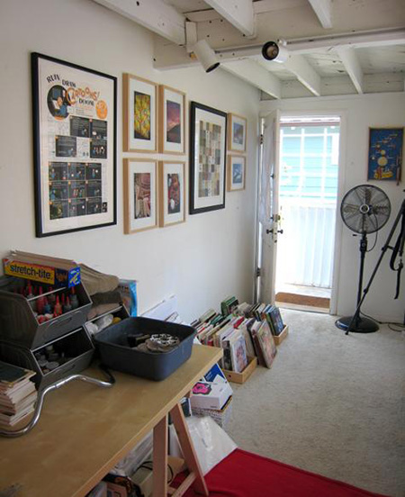
We encourage you to visit Design Sponge, to see arguably their all-time best Sneak Peek into his living and working space. The line between life and art is thin, it turns out: Dewar writes beautifully and funnily about a place that is, inspiringly, at once spartan and steeped in art. On the wall, you can spot a giant silk-screened Chris Ware panel.
A Book By Its Cover allows us to briefly invade his privacy, too: through his sketchbooks!
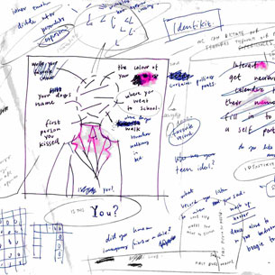
Notice the ratio of words and ideas to images. And notice all the circling and scratching out, all the testing and sorting through. This is ample evidence of a restless mind, which makes for a better illustrator. To enrich your art, he suggests on his site, you have to enrich your life and brain: read lots, look at other people’s work, cultivate interests, travel. Clearly he practices what he preaches. On the same page, he delves deeply into this process, with his customary warmth and deadpan asides.
We took notes. We’ll miss him dearly.
Buy his prints at Thumbtack Press. Trawl Google Images for his commissions. Pore over his work in his portfolio or at Veer. Marvel at his contribution to Readymade’s WPA-inspired Poster Children project. Flip through his Flickr stream.

Denis Darzacq, Hyper No.20, 2007. 50 x 40″.
Denis Darzacq’s Hyper exhibition, at the Laurence Miller Gallery, ventures into the supermarket. Obviously this isn’t your average grocery store. Bodies pause mid-air near the frozen food, bend at freak angles, levitate toward the top shelves. But why, of all places, in this place? Darzacq seems to be casting his solitary souls into Andreas Gursky’s famous panorama of merchandise.

Andreas Gursky,99 cent, 1999. 6′ 9 1/2″ x 11′.
Too many choices and desires overwhelm us, Gursky’s rainbows of sugar and plastic tell us. Putting people in the foreground, not things or crowds, Darzacq renders this same feeling in a more haunting style. There’s something empty and creepy about our zombielike urge to accumulate, and here that emptiness and creepiness is given form: the subjects are tractor-beamed skyward by unseen forces; their faces swivel mysteriously away from us; a sickly fluorescent light refrigerates every composition; the aisles are cleared, you suspect, even of sound. These tableaux vivants, like those of Gregory Crewdson, remind you that the ordinary world we’ve taken for granted is, on closer inspection, a good deal more surreal than we notice.

Denis Darzacq, Hyper No.3, 2007. 50 x 40″.

Happy Belated Birthday Jackie!
How cool is this picture? She always hikes and camps in the most beautiful places. Did you know that I carved my first pumpkin at Jackie’s apartment? And when I had no place to go for Easter break at ND, she took me home to Pittsburgh and introduced me to burgers served with french fries inside them. And even though she lived off campus her senior year, I could always count on her or Jen to drive by the main circle to pick me up. I’m a lucky girl. Now if all my friends weren’t spread out across the country, things would be much better!
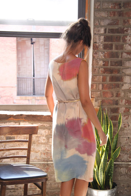

Shabd SS10 Collection. So beautiful. Hat tip: unruly things.
Hi. Outfit #1 for July? Hmm. Growing up, tie dye was a staple for field day uniforms. I especially loved the event where the entire team had to maneuver a gigantic beach ball around the obstacle course. The second picture perfectly captures my mood this week: relieved it’s Friday and ready to spend some time outside!
Starting new projects like those that involve clay can be exciting but exhausting. Students are eager to begin but don’t want listen. I think I impressed a few with my (ahem) loud voice—I just don’t like to bring it out much. Also, high school kids are not sneaky at all. Why would you ask if you can make a bong, shot glass, martini glass, or ash tray? I wonder if they sincerely thought I would say, “Sure, as long as it has great surface treatment!”
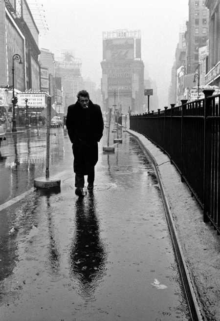
The story of Dennis Stock (1928-2010) is intertwined with the story of cool. Such is the fate of a virtuoso photographer who, present at the right time and the right place, potently documented America’s passage from strait-laced postwar gloom into the fiery emotions of the misfit mid-century. His portraits hinted at the blooming counterculture: a dissenting, introspective crowd equally given to brooding loneliness and ecstatic reverie. It is no exaggeration to say that, for one, his 1955 shots for Life magazine helped craft the myth of James Dean. While shooting a visual essay on the actor not long before his fatal car accident, Stock snapped the legendary, and legend-forging, image of Dean in Times Square, strolling what Life called the the Street of Broken Dreams. As Adam Gopnik saw it: “bearing the weight of a generation on his shoulders.” With his hunched posture, enveloped in his overcoat, and that squint, that cantilevered cigarette, he looked uncannily like Albert Camus. Shielding himself from the rain, seemingly the last citizen of New York, Dean was the picture of the existential loner.
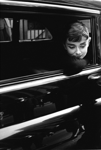
Invited on to the set of Billy Wilder’s film Sabrina, Stock displayed his talent for capturing moments of vulnerability, when artists conscious of publicity and image fleetingly let their guards down. Here we see Audrey Hepburn resting on a car window, lost in thought, perhaps, casting her famously gamine gaze downward. “She was very un-Hollywood, which was the key to the whole thing,” Stock remembered. “She wasn’t glamorous. She didn’t try to be glamorous.”
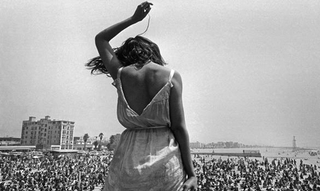
The spirit of the age was available in his portraits: you could sense the national mood shifting. In 1968, freezing a moment of abandon on Venice Beach, he expressed the libertine freedom of that time. A woman stood, back to the camera, against a sea of youth rapt by music, simultaneously an individual and part of something larger. It’s no surprise that his philosophy of photography was refreshing and vital–“To be able to continue an attitude of childlike discovery into adult existence can only be perceived as a gift toward the individual’s spiritual survival”–and it spoke to both the joy of artmaking, and its place in a full life.
Stock worked for the prestigious Magnum agency for six decades. They gather more of his work here.